


Click4Assistance presents - How to gather more lead information online


Your website is designed to capture lead information and drive traffic through your call to action to conversion pages such as brochure requests or email sign ups.
The question is; are you maximising your potential click through rate? Making small tweaks to your online contact and sign-ups forms can help gather more lead information and increase your online conversion rate. Visitors are often reluctant to enter their contact details, so why not make it easy for them? Check out these handy tips to improve your lead generation online.
Consider Form Design
There’s no secret to designing the perfect contact or sign up form, but there are small changes that you can make to influence the click through rate. In terms of design, you should try and keep it simple. This means a clear form with no images or clickable links that can detract your visitor from entering their information and clicking submit. Make your instructions clear, simple and be sure to use colour so the form stands out when visitors land on your website.
Ask yourself ‘How much information do I need to gather from this form?’ Go for the bare minimum and make these fields compulsory. If there are others you would like to include, you can make these optional. It’s a simple science, the more information you request, the lower your uptake will be. Of course there is a balance to be struck between qualifying the lead and gathering their details.
Think about your call to action button
The simple text on your call to action buttons can make a big difference to your click through rate and lead generation potential. The phrase ‘Submit’ isn’t always the most effective option. Instead you should try and make the phrase relevant to the action. For an email form you could try ‘Sign Up’ as your button text. Other options to consider are ‘Click Here and ‘Go’, both of these have been proven to achieve a higher click through rate compared to ‘Submit’.
Equally important is the colour of your button as it should stand out on your form, be noticeable and draw your visitor’s attention. Colours are proven to evoke different emotions from people, and this can be used to your advantage online. Orange especially provokes an aggressive call to action, subscribe or buy feeling which is why it’s perfect for your action buttons. It’s no coincidence that sites such as Wordpress use it on their sign up page, and Play.com on their buy now buttons.
What’s in it for your visitor?
When prompting your website visitors to sign up to your newsletter or your product brochure, you have to sell them the benefits and put their mind at ease. This is done by building their trust, and providing a short link to a privacy statement.
So why should your visitors give you their precious contact details? What will they gain by signing up to your email list or requesting your product brochure? Although you are keeping the signup form simple, there’s still room for a short message spelling out the benefits. ‘Download our product brochure’ is boring and doesn’t entice me into downloading anything. However, ‘Download our brand new product brochure to see how you can join thousands of other companies and increase your sales today’ sets out an inviting promise.
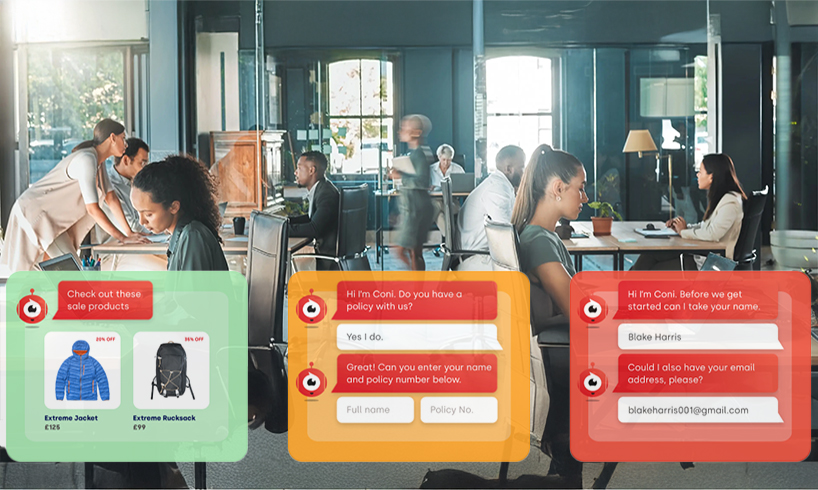
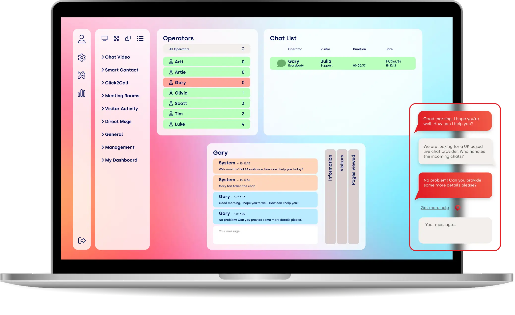
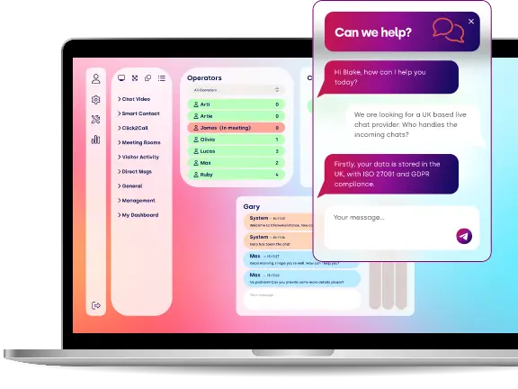
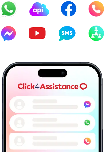
Offer Live Chat
The best Live Chat software will allow you to gather visitor information on a 'pre chat' form before the chat commences, a whole lot easier than having to ask for information over the phone. Offering assistance to visitors when they are completing forms will ensure a higher completion rate. Did you know you can redirect your visitor automatically during a live chat? This kind of navigational help can be the difference between a conversion or an abandonment.
Split Test and Try something different
Don’t underestimate the importance of split testing everything. When implementing changes into your online forms, they should be done gradually. This way you can test every change and measure its impact on your click through rate. Equally, you shouldn’t be afraid to try something different and measure its impact. Why not try allowing visitors to sign up for your newsletter without having to navigate away from their current page?
Check us out on Facebook and Twitter to receive all of our latest blogs first!